6. Central Composition Creates Symmetry
In Architecture Photography
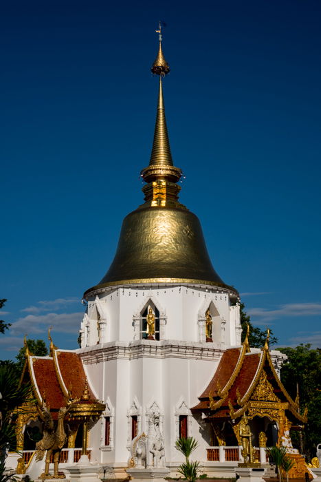
Architects and designers often use symmetry in their construction and layouts. It makes sense to embrace this when photographing architecture. Using the rule of thirds will not produce the most compelling photograph. Look to see where there is balance and whether central compositions will enhance it. Find an angle that gives you an even balance of symmetrical structure. Line the center of your viewfinder or monitor up with the central line of the structure. Check to see if most of what’s in the left and right sides of your frame are the same. Bell shaped Chedi at Buddhist temples often are best photographed using central composition. This one at Wat Pa Dara Phirom near Chiang Mai in Thailand is an interesting example. Raised off the ground by a square shaped lower floor, the round chedi stands out against the clear blue sky. If I had used the rule of thirds, I would have had to crop the structure. Or I would have had to include other surrounding elements in my frame. This would have distracted from my main subject. A central composition made the architecture stand out.
Faces
Faces are symmetrical, more or less. Cropping in tight to a face will be interesting if you use balanced framing. Position the central line of your view finder or monitor running between the eyes. Hold your camera so this vertical line continues down through he middle of the nose and mouth. Both sides of the face will be balanced, so long as your subject is facing your lens. If you are a little to one side or the other, or your subject’s face is turned, the result will not be symmetrical. Pay careful attention to the center line and the edges of your frame. Look to check that what’s on the left side matches what’s on the right side. If your camera has the option to display a grid in the viewfinder and monitor, make use of it. It will help you be more precise. You could also try lining up more than one symmetrical element. In this photo I lined up the pinnacle of the building’s roof with the Buddha statue on the hill above it. If you look at the bottom left and right of the photo you will see it is not quite balanced. The design on the pavement is off center also. More of the structure at the right side is showing than on the left side. Moving a little to my left I could have lined up the pavement design and structures on either side evenly. Had I done that, the line between the roof and the Buddha statue would have been broken.
5. Create Feeling in Your Photos
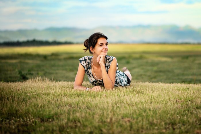
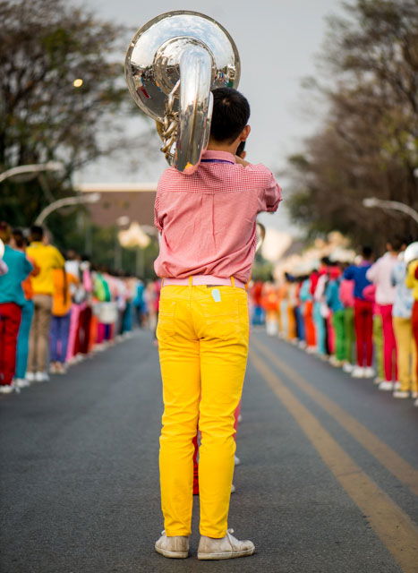
Satisfying photography composition usually helps to convey some kind of feeling. Central composition can often help express sentiments of peace or power. Peace is often associated with balance. When things are in harmony a relaxing feeling is often present. Don’t be scared to use central composition to build this into your photographs. My friend lying on the grass is a very peaceful scene. I wanted to enhance this by breaking the rules of composition because I thought it would add feeling. I split my frame approximately into thirds horizontally. But I placed her in the vertical center of my frame. There was an even amount of space on either side, as well as above and below. This gives a sense of peaceful confidence that reflects her expression. Try placing the dominant eye on the central vertical in the frame. This shows power and confidence. The subject’s gaze will follow you no matter where you look at the photo from. His central position is commanding. Even though I have photographed him from behind and we cannot see his face. I made this photo from a half crouched position. This allowed the lines of band members on either side to converge in the middle. Additionally, this created great leading lines to guide the viewer’s eye.
4. Try a Square Frame to Highlight Symmetry
Central composition lends itself to square frames. The shape is all about symmetry and balance. When the elements are right you can make very creative photos using this composition technique. You have to be looking for the right situations and experimenting. Break the rules of composition, go square and central. Don’t always place your subject using the rule of thirds. Often I will crop to a square in post production. Sometimes it is because I have composed using the rule of thirds. When I see it on my monitor I realise the image will be stronger as a square. I photographed the cow as a vertical. I did like the expanse of sky above the cow. It helps convey the huge open field it was walking in. But I prefer it square because of the symmetry created by cropping it. The animal placed on the vertical center is balanced well by the strong horizontal lines in this photograph. I took this photo of our little friend Malu using my outdoor photography studio. I positioned her centrally in the horizontal frame. As I was processing it I decided to experiment to see if cropping it square would enhance the photo. I had placed her centrally on the vertical when I took the photo. When I cropped to the square format I positioned her mouth on the horizontal central line. This makes a stronger, more interesting portrait. Thinking square can be challenging when you are composing in a rectangular frame. Don’t be bound by the constraints of your camera’s view finder or monitor and think in the square box at times.
3. Photography Composition for Simplicity
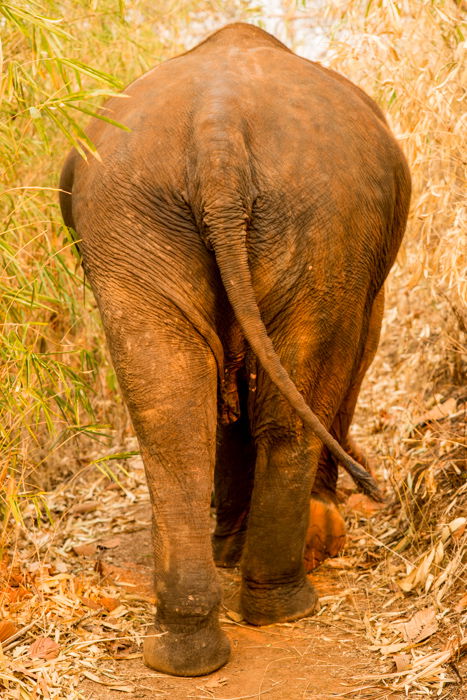
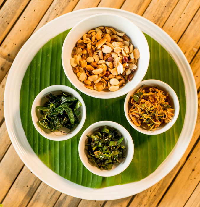
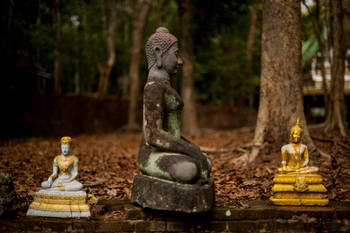
It has been said that simplicity is the essence of all good design. Central composition is about as simple as you can make it. That is why most new photographers use it without thinking or knowing about it. It is natural. People usually look at what is right in front of them. Having two eyes makes it more comfortable to face what you are focusing on. This makes it normal to do the same with a camera when we first start using one. Our vision is not bounded by frame edges and corners as our photos are. This simplifies what we see in a photograph compared to how we see real life. Placing your subject in the center of the frame often amplifies this. Coming in tight to the rear of the elephant I saw the only option I had to compose well was to line it up centrally. The dry bamboo either side of the path offered nothing interesting to add to the composition. Cropping tighter would not have conveyed the movement the position of the legs and tail add. It is very simple, yet effective. The simplicity of the centrally placed round plate is pleasing. The four round bowls and the green banana leaf are all harmonious. The diagonal lines of the bamboo table add a little contrast to all the circles. It is central and very simple, yet not completely symmetrical. I aligned the larger Buddha statue in the center with the two, lighter colored smaller ones on the side. This is a very simple composition. The triangular shape formed with the main subject in the middle is well balanced. If the two smaller statues had not been there it would not balance so well. The background would be more prominent. In these three examples of simplistic central composition, I also used other techniques.
Tight cropping and timing the elephant’s walk to show movement. Circles and diagonals with an overhead perspective help simplify an image. Triangular shape and a blurred background to emphasis the central figure.
2. Central Composition Will Draw Attention to Your Subject
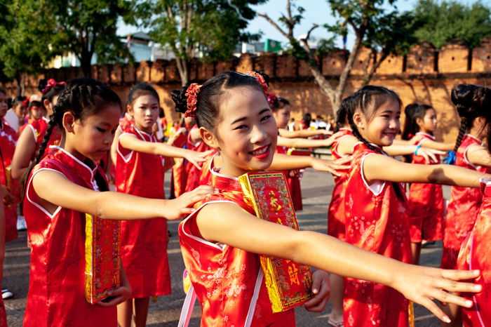
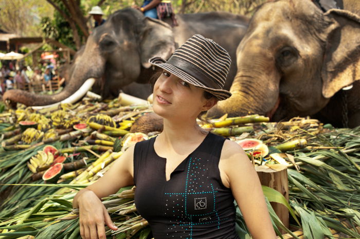
Placing your subject in the center of your frame will help draw attention to them. If there’s minimal elements in your composition this is not so important. Where you have a lot going on in the frame the need for central composition becomes more evident. This is especially so when there are many similar elements within the frame. These young girls were lining up preparing to take part in a Chinese new year parade. It is a very busy scene that works only because I focused on one girl. Placing her in the center of my frame she is undoubtedly my main subject. Had I framed her more towards one side of the frame the composition would not be so effective. If I had composed the photo without a clear center of attention it would not have been so engaging. Picking out one main subject from a group like this will often make a more interesting photograph. Try to narrow in on a single person or element. Make it more prominent in your composition by placing it in the middle of your frame. You will see how much more outstanding your subject is. In this photo of my friend, the elephants could have been a distraction. Because of the central composition, she commands your attention instead.
Reason 1: Creating a Sense of Depth
We see in three dimensions yet photos are flat and two dimensional. To create effective, strong photographs at times it can be necessary to add a sense of depth. Central composition can help achieve this. There are various other photographic techniques and methods which can also add a sense of perspective to an image. Some of these are:
Figure to ground; Aperture choice to control depth of field; Lens choice; Placement of other elements within the frame.
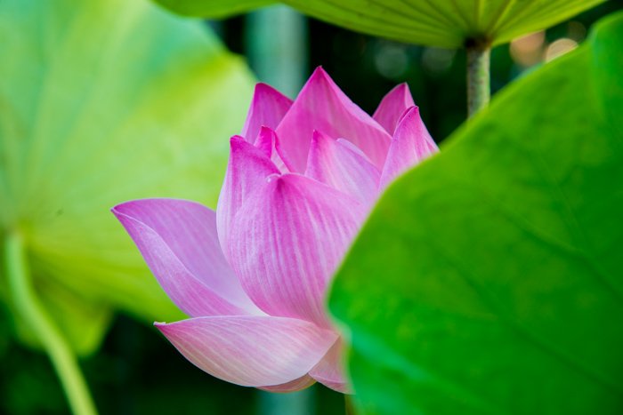
Balancing the space around the main subject of your photo creates depth. Having a main subject in the center of the photo comes quite naturally to us. This makes it easier for our minds to perceive depth. A central composition can also add perspective. Having other elements in the frame can help support your main subject and enhance depth. The center of the lotus flower is central to my composition. The leaf in the foreground on the right adds to the depth perception. Our minds still can envisage a whole flower because of the central composition. The lighter leaf in the background helps create a sense of perspective. Composing with the flower more to the left or right of my frame would have minimised the sense of depth. Empty space in the foreground and the open sky above the couple’s heads, combined with their central position, create depth. If I had placed them more to one side or the other the photo may have more of a sense of distance, but not depth so much. Leaving more negative space to either side in a photo like this will provoke thoughts of how far they will walk. It will not help give a sense of depth. The central composition does this.
Composition: Combing Elements to Form a Whole
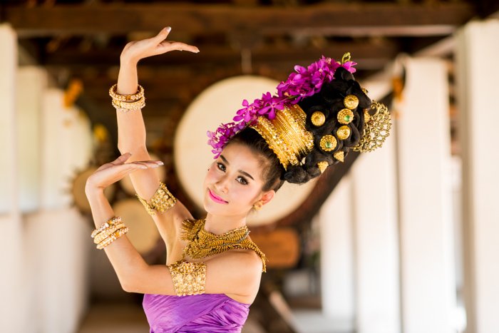
With any photo there are multiple factors which must come together to make it stand out. Good composition is rarely the result of one method, setting or technique. Every situation you photograph is different. You need to experiment with the rules and try applying different ones. Don’t place every subject in the center or on a third. For the photos used in this article, central composition is one technique. But I combined it with other composition rules and photography methods. A shallow depth of field strengthened the photo of the Thai model. The right side of the frame almost filled with another model’s head also adds to the effect. Converging lines are another element in my photo of the boy in the marching band. This also appears in the photo of the pavement leading to the temple. Mountains add scale and perspective to the photo of the backpacking couple.
Conclusion
As you learn the rules and practice central composition, leave a little more room. Do not crop in to your main subject so much. Having more room around your central subject will allow you to try different crops. You will be able to compare and decide which you prefer and why. I am not encouraging you to be lazy, but mindful. Don’t get careless with your in-camera composition thinking you can fix it later. Be thoughtful about your composition and then leave a bit more space all around. If you can, make a few different compositions. You have some choice of which center to use, or to use them both – horizontal and vertical.


title: “6 Great Central Composition Tips Better Photography " ShowToc: true date: “2023-01-14” author: “Morgan Kelley”
6. Central Composition Creates Symmetry
In Architecture Photography
Architects and designers often use symmetry in their construction and layouts. It makes sense to embrace this when photographing architecture. Using the rule of thirds will not produce the most compelling photograph. Look to see where there is balance and whether central compositions will enhance it. Find an angle that gives you an even balance of symmetrical structure. Line the center of your viewfinder or monitor up with the central line of the structure. Check to see if most of what’s in the left and right sides of your frame are the same. Bell shaped Chedi at Buddhist temples often are best photographed using central composition. This one at Wat Pa Dara Phirom near Chiang Mai in Thailand is an interesting example. Raised off the ground by a square shaped lower floor, the round chedi stands out against the clear blue sky. If I had used the rule of thirds, I would have had to crop the structure. Or I would have had to include other surrounding elements in my frame. This would have distracted from my main subject. A central composition made the architecture stand out.
Faces
Faces are symmetrical, more or less. Cropping in tight to a face will be interesting if you use balanced framing. Position the central line of your view finder or monitor running between the eyes. Hold your camera so this vertical line continues down through he middle of the nose and mouth. Both sides of the face will be balanced, so long as your subject is facing your lens. If you are a little to one side or the other, or your subject’s face is turned, the result will not be symmetrical. Pay careful attention to the center line and the edges of your frame. Look to check that what’s on the left side matches what’s on the right side. If your camera has the option to display a grid in the viewfinder and monitor, make use of it. It will help you be more precise. You could also try lining up more than one symmetrical element. In this photo I lined up the pinnacle of the building’s roof with the Buddha statue on the hill above it. If you look at the bottom left and right of the photo you will see it is not quite balanced. The design on the pavement is off center also. More of the structure at the right side is showing than on the left side. Moving a little to my left I could have lined up the pavement design and structures on either side evenly. Had I done that, the line between the roof and the Buddha statue would have been broken.
5. Create Feeling in Your Photos
Satisfying photography composition usually helps to convey some kind of feeling. Central composition can often help express sentiments of peace or power. Peace is often associated with balance. When things are in harmony a relaxing feeling is often present. Don’t be scared to use central composition to build this into your photographs. My friend lying on the grass is a very peaceful scene. I wanted to enhance this by breaking the rules of composition because I thought it would add feeling. I split my frame approximately into thirds horizontally. But I placed her in the vertical center of my frame. There was an even amount of space on either side, as well as above and below. This gives a sense of peaceful confidence that reflects her expression. Try placing the dominant eye on the central vertical in the frame. This shows power and confidence. The subject’s gaze will follow you no matter where you look at the photo from. His central position is commanding. Even though I have photographed him from behind and we cannot see his face. I made this photo from a half crouched position. This allowed the lines of band members on either side to converge in the middle. Additionally, this created great leading lines to guide the viewer’s eye.
4. Try a Square Frame to Highlight Symmetry
Central composition lends itself to square frames. The shape is all about symmetry and balance. When the elements are right you can make very creative photos using this composition technique. You have to be looking for the right situations and experimenting. Break the rules of composition, go square and central. Don’t always place your subject using the rule of thirds. Often I will crop to a square in post production. Sometimes it is because I have composed using the rule of thirds. When I see it on my monitor I realise the image will be stronger as a square. I photographed the cow as a vertical. I did like the expanse of sky above the cow. It helps convey the huge open field it was walking in. But I prefer it square because of the symmetry created by cropping it. The animal placed on the vertical center is balanced well by the strong horizontal lines in this photograph. I took this photo of our little friend Malu using my outdoor photography studio. I positioned her centrally in the horizontal frame. As I was processing it I decided to experiment to see if cropping it square would enhance the photo. I had placed her centrally on the vertical when I took the photo. When I cropped to the square format I positioned her mouth on the horizontal central line. This makes a stronger, more interesting portrait. Thinking square can be challenging when you are composing in a rectangular frame. Don’t be bound by the constraints of your camera’s view finder or monitor and think in the square box at times.
3. Photography Composition for Simplicity
It has been said that simplicity is the essence of all good design. Central composition is about as simple as you can make it. That is why most new photographers use it without thinking or knowing about it. It is natural. People usually look at what is right in front of them. Having two eyes makes it more comfortable to face what you are focusing on. This makes it normal to do the same with a camera when we first start using one. Our vision is not bounded by frame edges and corners as our photos are. This simplifies what we see in a photograph compared to how we see real life. Placing your subject in the center of the frame often amplifies this. Coming in tight to the rear of the elephant I saw the only option I had to compose well was to line it up centrally. The dry bamboo either side of the path offered nothing interesting to add to the composition. Cropping tighter would not have conveyed the movement the position of the legs and tail add. It is very simple, yet effective. The simplicity of the centrally placed round plate is pleasing. The four round bowls and the green banana leaf are all harmonious. The diagonal lines of the bamboo table add a little contrast to all the circles. It is central and very simple, yet not completely symmetrical. I aligned the larger Buddha statue in the center with the two, lighter colored smaller ones on the side. This is a very simple composition. The triangular shape formed with the main subject in the middle is well balanced. If the two smaller statues had not been there it would not balance so well. The background would be more prominent. In these three examples of simplistic central composition, I also used other techniques.
Tight cropping and timing the elephant’s walk to show movement. Circles and diagonals with an overhead perspective help simplify an image. Triangular shape and a blurred background to emphasis the central figure.
2. Central Composition Will Draw Attention to Your Subject
Placing your subject in the center of your frame will help draw attention to them. If there’s minimal elements in your composition this is not so important. Where you have a lot going on in the frame the need for central composition becomes more evident. This is especially so when there are many similar elements within the frame. These young girls were lining up preparing to take part in a Chinese new year parade. It is a very busy scene that works only because I focused on one girl. Placing her in the center of my frame she is undoubtedly my main subject. Had I framed her more towards one side of the frame the composition would not be so effective. If I had composed the photo without a clear center of attention it would not have been so engaging. Picking out one main subject from a group like this will often make a more interesting photograph. Try to narrow in on a single person or element. Make it more prominent in your composition by placing it in the middle of your frame. You will see how much more outstanding your subject is. In this photo of my friend, the elephants could have been a distraction. Because of the central composition, she commands your attention instead.
Reason 1: Creating a Sense of Depth
We see in three dimensions yet photos are flat and two dimensional. To create effective, strong photographs at times it can be necessary to add a sense of depth. Central composition can help achieve this. There are various other photographic techniques and methods which can also add a sense of perspective to an image. Some of these are:
Figure to ground; Aperture choice to control depth of field; Lens choice; Placement of other elements within the frame.
Balancing the space around the main subject of your photo creates depth. Having a main subject in the center of the photo comes quite naturally to us. This makes it easier for our minds to perceive depth. A central composition can also add perspective. Having other elements in the frame can help support your main subject and enhance depth. The center of the lotus flower is central to my composition. The leaf in the foreground on the right adds to the depth perception. Our minds still can envisage a whole flower because of the central composition. The lighter leaf in the background helps create a sense of perspective. Composing with the flower more to the left or right of my frame would have minimised the sense of depth. Empty space in the foreground and the open sky above the couple’s heads, combined with their central position, create depth. If I had placed them more to one side or the other the photo may have more of a sense of distance, but not depth so much. Leaving more negative space to either side in a photo like this will provoke thoughts of how far they will walk. It will not help give a sense of depth. The central composition does this.
Composition: Combing Elements to Form a Whole
With any photo there are multiple factors which must come together to make it stand out. Good composition is rarely the result of one method, setting or technique. Every situation you photograph is different. You need to experiment with the rules and try applying different ones. Don’t place every subject in the center or on a third. For the photos used in this article, central composition is one technique. But I combined it with other composition rules and photography methods. A shallow depth of field strengthened the photo of the Thai model. The right side of the frame almost filled with another model’s head also adds to the effect. Converging lines are another element in my photo of the boy in the marching band. This also appears in the photo of the pavement leading to the temple. Mountains add scale and perspective to the photo of the backpacking couple.
Conclusion
As you learn the rules and practice central composition, leave a little more room. Do not crop in to your main subject so much. Having more room around your central subject will allow you to try different crops. You will be able to compare and decide which you prefer and why. I am not encouraging you to be lazy, but mindful. Don’t get careless with your in-camera composition thinking you can fix it later. Be thoughtful about your composition and then leave a bit more space all around. If you can, make a few different compositions. You have some choice of which center to use, or to use them both – horizontal and vertical.
